Tuesday, November 25, 2014

The Relative Strength Factor

The Relative Strength Factor is a vital member of the trading strategy toolbox for many longer term investors.

It is used to measure performance of one instrument against a group of instruments and from that measurement an investor can quickly determine if he will do further work or look for another instrument to invest in.

ETF investors use this measure constantly as they are evaluating. Several sites on the internet have screeners available for their version of the Relative Strength Factor.

There is more than one way to develop a Relative Strength Factor, eg you can use the current stock price move against the related index value, or compare percentage change in the price versus percentage change of the index price.

There are a few places on the internet that offer screens related to the Relative Strength Factor'

  • Investors Business Daily for Stocks
  • ETFSCREEN for Etfs
  • Microsoft
  • ETFdb
  • TMXMoney
  • Morningstar


Here is an article regarding screening Wall Street Journal including a number of resources.

ETF Information Overload!


According to Dorsey Wright

'Relative strength strategies have a long history of delivering market-beating returns.'

ETF Chart of the Day, November 25, 2014

This ETF, Direxion Daily Healthcare Bull 3X ETF is showing considerable strength of late and probably deserves a close look.

Some information from the management of the fund, Direxion Investments:


Fund Symbol CURE
Daily Target 300%
Intra-day Indicative Value CURE.IV
Bloomberg Index Symbol IXV
CUSIP 25459Y876
ISIN US25459Y8764
Gross Expense Ratio 1.21%
Net Expense Ratio 0.95%*
Inception Date Jun 15, 2011

Overview

The Daily Healthcare Bull 3x Shares seeks daily investment results, before fees and expenses, of 300% of the performance of the S&P Health Care Select Sector Index. There is no guarantee the fund will meet its stated investment objective.
This leveraged ETF seeks a return that is 300% the return of its benchmark index for a single day. The fund should not be expected to provide three times the return of the benchmark’s cumulative return for periods greater than a day.


Performance
NAVs and market price information as of November 24, 2014


All data as of 10/31/2014
Ticker Fund Name 1 Mo % 3 Mo % YTD % 1 YR % 3 YR % 5 YR % 10 YR % Since Inception Inception Date Expense Ratio* (Gross/Net %)
CURE Daily Healthcare Bull 3x Shares NAV 14.81 32.62 71.99 100.25 96.12 71.22 1.21 / 0.95*
Market Close 14.92 32.69 71.80 99.16 94.06 71.21


From WallStreet Scope Nov 7

Direxion Daily Healthcare Bull 3X ETF (CURE) of the Financial sector (Exchange Traded Fund) lost -2.75%, a change from open of -3.5700% ($-3.23 per share) at the close of the normal trading day Friday with a volume of 95712 shares.  Direxion Daily Healthcare Bull 3X ETF (CURE) ended the day at $117.43 with a market cap of ,  insider ownership of , volume of  095,712 and a weekly performance of 2.84%. Direxion Daily Healthcare Bull 3X ETF (CURE)’S monthly performance stands at 13.27% and Direxion Daily Healthcare Bull 3X ETF (CURE) is considered a stock to watch for the upcoming trading day.

Here is a chart made after the close on Tuesday Nov 25, you can see that this stock has had a long advance and is still very strong.

In fact, the Relative Strength Factor for this ETF is 99.6


I want to draw your attention to the Point and Figure chart for this instrument, you will see a Bullish Price Objective of $215.00


This ETF is certainly deserving of a place in your watchlist and may well become a part of your trading strategy.


Good Trading..!

Some additional information on the Relative Strength Factor


Renko Trading Strategy


Renko Bars are not the most popular trading strategy but they are quite effective for filtering out the choppy periods and when used judiciously can be quite profitable.

As an example, I have two charts of EURUSD from this morning, one just prior to a sudden drop and one taken a few minutes after the drop. You can see how the chart worked well for me using the Awesome Oscillator for entry and the TSIOsc for exit. I also watch the TSIOSC for warning of a pending shift in trend.


Traders use different bar sizes for their Renko charts and that is a matter of preference. Some people like a 2 pip bar and others use up to 50 pips, depending on how often they want to trade and be at the screen watching charts.

Some trading platforms have a Renko chart built in as an indicator and many do not, meaning that a custom indicator has to be used. Sometimes in the case of a custom indicator there is quite a demand for machine resources which limits the number of charts that can be used .

There are custom indicators for both Metatrader4 and Metatrader5.

Renko trading is a great strategy in that a person can see clearly the entries and place stop losses that work well based on the size of the Renko bars on that particular chart.

I have not found any trailing stop expert advisers that will work on a Renko chart, they have to be attached to the regular chart for that currency pair.

Nor have I found a trade manager that will work on a Renko chart, again the trade manager has to be attached to a regular currency pair.

Those are a couple things that make trading with Renko bars a little awkward.

However, even with a couple negatives the Renko Trading Strategy can be enjoyable and profitable.


I will add one more chart, a 40 pip move that just occurred, actually the move was for a bit more than 40 pips.


Stock Scan Results by the Rambunctious Pig As At 8:15 am EST November 25, 2014

Todays Stock scans are more or less a comparison between the NYSE and the Nasdaq exchanges, they seem to move in harmony. I have done several comparisons as you will see below.


These results are for November 24 close.


I was surprised to see the similarity in the results.

Later I will add 56 Forex pairs to the mix as well as  a couple more stock scans.


Good Trading..!

Sunday, November 23, 2014

Have a Look at the 50 Moving Average Trading Strategy

The 50 moving average trading strategy can have some excellent points.

The 50 moving average can be used in combination with other moving averages such as the 200 or 100 or 20 to pinpoint moving average crossover entries and exits.

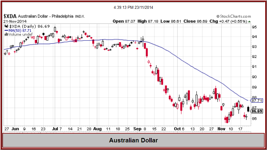
Another use for the 50 day moving average is to compare what may be happening between different groups of currencies.

For example, I have placed several charts on this page which show the relationship of price to the 50 day moving average, you will see price reverting to the mean and crossing the average and approaching the average.

Notice that all of these prices are below the 50 moving average with the exception of the US Dollar.


As you can see, a review of the 50 Moving Average can give you a quick idea as to what is happening to many currency pairs with regard to the other and similar pair.

You will also notice that from time to time there are some good price moves signaled by the 50 moving average.


Have a great week ahead..!

Magic Bands Scalp Trading Strategy as at November 23, 2014

The Magic Bands Scalp trading strategy will do well again this week for trend traders who are patient enough to find a trending market.

The tip off to a trade entry for this system is the crossing of the 15 BB and the 50 BB.

Probably a trader will want to have several charts open so as to be able to be in the market as different  currency pairs are trending at different times throughout the trading day

I have three charts below from Friday past.


Entries are best in the Magic Bands scalp system when there is a slope to the trend lines, the Bollinger Bands.

Personally I do my best to avoid the choppy periods with no slope to the lines..... I have had terrible experiences trading in chop. lol


Good Trading..!


My Gold Trading Strategy as November 23, 2014

The new week is about to test our trading strategies. Governments will be making their moves, traders will be in and out of the market and who knows what is coming for Gold.

There are a lot of opinions, Gold is going to $5,000 and Gold is dropping to $800, I will post some opinions further down in this post.

First I will post a couple charts, Ichimoku Kinko Hiyo charts, reason being is, they have something to tell us about support and resistance.

Here is the daily chart of XAUUSD


It is easy to see that the is going to be resistance at the Ichimoku Cloud. It appears that the Cloud becomes narrower as days pass, maybe resistance to a price rise will lessen.


The weekly chart is next.


Once again we see the Ichimoku Cloud creating resistance although the Cloud is much thinner than on the daily chart.


Finally, the Monthly chart.


It took a couple months for price to break down through the Cloud and then finally support was broken. The November bar has a long wick, showing that the bulls are making progress....


As mentioned earlier in the post, I found some recent articles and opinions about Gold as follows:


Russia's Central Bank Buying Gold Isn't Quite What You Think It Is - Forbes

Sat, 22 Nov 2014 11:42:03 GMT
The Russian central bank has been buying more gold this year. This could be taken as some form of support for the price of gold, could be taken as simply the bank deciding that t ...

Read more ...


Swiss Central Bank Chief Warns on Impact of Gold Vote - Wall Street Journal
Sun, 23 Nov 2014 13:31:49 GMT

ZURICH—The head of the Swiss National Bank reiterated concerns that a popular vote on requiring the central bank to keep a fifth of its assets in gold would hi ...

Read more ...


Gold No Longer Slumbers - Barron's
 Sat, 22 Nov 2014 03:15:13 GMT

But after pummeling gold steadily lower from its peak around $1,900 an ounce in September 2011, he is showing signs that he could be done dumping on the metal, which hit a low of $1,131.85 an ounce this month. Gold-mini ...

Read more ...


Many are seeing the moves by China as bullish for the price of Gold.

Chinese rate cut pushes gold, silver to highs - Resource Investor
Sun, 23 Nov 2014 11:44:43 GMT

The rate reduction was the first since July 2012 as the Asian nation heads toward its slowest full-year expansion in almost a quarter century. Russia added to gold reserve ...

Read more ...


This infographic is really well done!

InfoGraphic on the Swiss Gold Referendum to take place on November 30th - CoinWeek

Sun, 23 Nov 2014 14:37:40 GMT

On November 30, Swiss nationals head to the polls on three separate issues: abolishing a flat tax on resident, non-working foreigners, an immigration cap, and a proposal o ...

Read more ...


Gold / Silver / Copper futures - weekly outlook: November 24 - 28 - Investing.com
Sun, 23 Nov 2014 13:38:11 GMT

Despite Friday's upbeat performance, gold prices are likely to remain vulnerable in the near-term amid indications a strengthening U.S. economic recovery will force the Fed ...


Read more ...


Good Trading in the week ahead...!


Saturday, November 22, 2014

Stock Scan Results by the Rambunctious Pig As At 7:15 pm EST November 22, 2014

The contents of this post may temper your trading strategy for the next couple days. I have created an 'index' of 992 stocks that trade between $10 and $25 at the close Friday so that I can measure certain aspects of that 'index' and also to compare individual instruments against it as well.

The first scan that I can describe was to measure the momentum of the index and also the momentum of the 992 instruments as decreasing or increasing as of Friday close.


First, here is the chart of the index that I created.


The lower chart shows the 'homemade' momentum indicator and, as you can see, the momentum is almost neutral for the group.

Next I did a scan to determine how many are decreasing and how many are increasing in momentum.

  • Decreasing in momentum are 508 instruments
  • Increasing in momentum are  484 instruments

The count is just about even and not really anything to base any decisions on based on Friday's data.

Here is another look at the same chart with a Slow Stochastic.


As you can see, the Slow Stochastic is approaching the overbought area which may indicate a move is coming.

Certainly we can not use this chart as any measure except perhaps to consider when making the trading plan for the next week.

I wanted to share that research today and as time passes I will be improving the scans on that group of stocks and sharing those with you.

I wish you the best with your trading strategy for the coming week.

Good Trading..!

Forex Scan Results by the Rambunctious Pig As At 5:15 pm EST November 22, 2014

One scan only this afternoon and this may affect your trading strategy for next week. Actually this is not a scan but a chart that reflects the momentum of the Forex market in the past few days.


I have made an 'index' of 56 currency pairs, including Gold and Silver, in order to be able to have a look at the momentum of the Forex market in general and also to be able to compare performance of individual currency pairs to the 'index'.

One of the indicators that I use on this chart is a 'homemade' momentum indicator that can reflect the direction of the momentum of the 'index.

For today's purpose, the chart only shows the 'homemade version of the momentum indicator, I have a couple more 'homemade' indicators that I use for different purposes.

Now here is the chart and you will see that the upward momentum of the past two months has turned bearish, which to me indicates that the market may be losing some of the steam it has been showing.

You will see that the last candle is similar to bearish engulfing, an indication that we may some reversals in coming days.


Hopefully this information will benefit your trading strategy for the coming week.

Good Trading..!

Friday, November 21, 2014

US Dollar Index Tracks Higher and Higher

Where will it stop?


The US Dollar Index has been on a tear for many weeks and shows no sign of easing off the pace.  Some blame the Quantitative Easing and some blame the international central banks for this movement, no one really knows what to attribute it to.

The US Dollar Index reflects the interchange between the US Dollar and other currencies, a basket made up of Euro, Japanese Yen, Pound Sterling, Canadian Dollar, Swedish Krona, Swiss Franc.

The index is traded as a futures contract.

I have here a Point & Figure chart which shows that the future price target of $106.00, quite a distance to travel from today's level of $88.36.

Today it is at a level of resistance as you can see on the chart.


Recent developments in Japan and Europe have devalued their currencies and pushed the US Dollar higher.

Today China reduced their interest rates to boost a sluggish economy adding more to the upward move of the US Dollar.

The US Dollar Index will certainly be something to watch regarding any dollar related trading strategy.

I have some commentary below which you may find relevant  and interesting.


Speculators' US dollar net long highest since 2008 -CFTC, Reuters - Reuters

Fri, 21 Nov 2014 20:56:57 GMT
Speculators' US dollar net long highest since 2008 -CFTC, ReutersReutersNov 21 (Reuters) - Speculators increased their net long U.S. dollar position in the latest week to its largest in six years, data from the Commodity Futures Trading Commission sh ...

Read more ...


The Long U.S. Dollar Trade Is Very Crowded - Wall Street Daily

Fri, 21 Nov 2014 10:06:28 GMT
After all, everyone seems to be long the U.S. dollar, which has been trouncing both the yen and euro over the past few months. But in reality, forex trading is one of the mos ...

Read more ...


How to Invest to Play a Stronger U.S. Dollar - Barron's

Fri, 21 Nov 2014 19:01:24 GMT
The GIC believes the U.S. dollar will probably strengthen further in 2015. While we are already overweight dollar assets, the tactical changes made today further increase this overweight pos ...

Read more ...


US Dollar Strength Shouldn't Undermine the Recovery - Institutional Investor

Fri, 21 Nov 2014 06:07:48 GMT
In 2010 policymakers roundly criticized Brazilian Finance Minister Guido Mantega for engaging in extreme rhetoric when he brought up the possibility of the ...


Read more ...


The next week will probably provide more volatility and great trade entries.

Good Trading.!!

Magic Bands Scalp Trading Strategy As As November 21, 2014

There was good volatility in the Forex markets today and some excellent opportunities using this simple strategy.

Let's review a couple charts.

First is AUDUSD, you can see a nice move up and then a gradual move down, two simple entries for profit.


Next is EURGBP. There was a nice bearish entry and then another on a retrace. It is important to  be sure that there is a slope on the 15 Bollinger Band and preferably on both sets of Bollinger Bands. This will keep you out of the chop.


GBPUSD. There were a couple bear entries, the second one being after a retrace. Once those two were finished, the next couple  of the potential entries were suspect based on the slope of the BB lines.


I have several more charts below, that you can observe..... note that the best entries have a good slope on the Bollinger Bands.


USDCHF Once the long move finishes the Bollinger Bands flatten out.. close the trade and look for another trade, avoid consolidations and ranging markets with this system. There are many opportunities daily with this system on different currency pairs


On the AUDCHF, once the price retraces to the 50 Bollinger Bands, it is time to get out of this pair and look for another pair to trade. There is no value to trading in the choppy market, it usually ends up in a loss.


CADCHF  Once the long entry retraces.... get out of this pair and look for another entry on another pair...  Stay away from the consolidation periods!


As mentioned, most important is the slope of the Bollinger Bands. There are enough entries available on different pairs that we can pick and choose and be selective as to the entries we take.

In order to be able monitor several pairs for trade opportunity I have a moving average crossover alert set for the 15 crossing the 50, That allows me to be aware of what is happening on different currency pairs as the day passes.

Again, a stop loss is important in this type of trading, I use a trailing stop as well.

Next week we will probably see more volatility in the markets and many resultant opportunities for this simple trading strategy.


Good Trading..!!

My Gold Trading Strategy as at November 21, 2014

Will the Butterfly make your trading strategy bullish?


This is a weekly chart and it seems that the butterfly pattern is having an effect as the price of Gold has been rising for three weeks.

Let's see what happened this week with the weekly pivot.


Right from the start of the week there was a bullish sentiment and the resistance was tested early before Gold dropped to bounce off the weekly pivot. Friday the resistance was tested again and ultimately the close was less than the resistance.

Now we can have a look at the Ichimoku chart and we can see that the price will meet the resistance of the Ichimoku Cloud with a further gain of ten dollars. You can see that recently price has approached the Cloud twice and been refused both times. Definitely there will be resistance to an upward move for a while, at least according to the Ichimoku Cloud.


Next we can have a look at the Point & Figure chart for Gold.


I have marked the resistance at $1,220.00 and you will notice that the bearish target is still set at $1,050.00. 

Next week will bring more excitement as Gold looks again for direction, hopefully our trading strategy will be profitable.


Good Trading...!


Thursday, November 20, 2014

Forex Scan Results by the Rambunctious Pig As At 5:15 pm EST November 20, 2014


I have revised the scans and included more scans, especially momentum which is at the bottom of the list.

You may find these to be helpful for your trading strategy.

I caution you that your data may be different from mine and these are done as at about 4:30 EST.


Bullish Macd Crossovers

EURAUD
EURCAD

Bearish Macd Crossovers

AUDCAD
AUDCHF
AUDDKK
CADCHF


NR4 Narrow Range

AUDJPY

Bullish 5 - 10 Macrossover

EURAUD


Bearish 5 – 10 Macrossover

AUDCAD
AUDDKK

Bullish Golden Cross

Bearish Death Cross

60 Day High

CADJPY
EURJPY
GBPJPY
NZDJPY
SGDJPY
USDJPY

60 Day Low


New Weekly High 5 DAYS

CADJPY
CHFJPY
EURAUD
EURCAD
EURJPY
EURNOK
EURNZD
EURSGD
GBPAUD
GBPJPY
GBPSGD
SGDJPY
USDHKD
USDJPY
USDNOK
USDSGD

New Weekly Low 5 DAYS

AUDCAD
AUDCHF
AUDDKK
AUDGBP
AUDNOK
AUDSGD
AUDUSD
CADCHF
EURCHF
NZDCAD
NZDCHF
NZDUSD


New Yearly High 200 DAYS

CADJPY
EURJPY
GBPJPY
NZDJPY
SGDJPY
USDJPY


New Yearly Low 200 DAYS


EURCHF


Increasing Momentum

AUDCAD
AUDGBP
AUDNZD
AUDSGD
AUDUSD
CHFJPY
EURAUD
EURCAD
EURCHF
EURDKK
EURGBP
EURJPY
EURNZD
EURSGD
EURUSD
GBPSGD
GBPUSD
NZDCAD
NZDUSD
USDHKD

XAGUSD
XAUUSD


Decreasing Momentum

AUDCHF
AUDDKK
AUDJPY
AUDNOK
CADCHF
CADJPY
EURNOK
GBPAUD
GBPCAD
GBPCHF
GBPJPY
GBPNOK
GBPNZD
GBPSEK
NZDCHF
NZDJPY
SGDJPY
USDCAD
USDCHF
USDDKK
USDJPY
USDNOK
USDSGD


Dragonfly Doji


Today Close is Lower than the Open

AUDCAD
AUDNOK
AUDNZD
AUDSGD
CHFJPY
EURAUD
EURCAD
EURGBP
EURNOK
EURNZD
EURSGD
EURUSD
GBPAUD
GBPCAD
GBPNOK
GBPSGD
USDCAD
USDNOK
USDSGD


Today Close is Higher than the Open

AUDCHF
AUDDKK
AUDGBP
AUDJOPY
AUDUSD
CADCHF
CADJPY
EURCHF
UURJPY
GBPCHF
GBPJPY
GBPSEK
GBPUSD
NZDCAD
NZDCHF
NZDJPY
NZDUSD
SGDJPY
USDCHF
USDDKK
USDHKD
USDJPY
USDSEK

XAUUSD
XAGUSD